Introduction

Hey there! If you’re running a construction company, you already know that your website is one of your most crucial tools. It’s not just a digital business card; it’s a robust platform where potential clients get to see your craftsmanship and decide if they’re dialing your number or someone else’s. But what makes a construction company website stand out from the rest? It’s not just about slapping pictures of your projects online and hoping for the best.
In this blog, we’ll dive into the key components that transform a good construction website into a great one. We’re talking about intuitive design that feels as solid as your work, stunning visuals that showcase your projects, and smart features that make visitors want to get in touch with you right away. Whether you’re thinking about a website overhaul or starting from scratch, these essential elements will ensure your online presence is built on a strong foundation.
Now, let’s lay down some groundwork and make sure your website really nails it!
User-Friendly Design

Alright, let’s talk about making your construction company website as user-friendly as possible. Think about it this way: when clients visit your website, it’s like they’re walking into your office. You want them to feel welcome, right? A user-friendly design ensures that your visitors can find exactly what they’re looking for without any hassle.
Here’s how to nail it:
- Responsive Design: Your website should look great and function smoothly whether it’s being viewed on a phone, a tablet, or a desktop. Most people will likely check you out from their mobile devices, so make this a priority!
- Easy Navigation: Keep it simple. A cluttered or confusing layout can turn potential clients away faster than you’d think. Aim for a clean menu with clear labels that guide users exactly where they need to go.
- Fast Load Times: Time is money, and nobody likes to wait. Ensure your web pages load quickly to keep your visitors happy and engaged. This might involve optimizing images and streamlining your site’s backend.
- Accessibility: Make sure everyone can interact with your website comfortably. Use legible fonts, adequate contrast, and consider features like keyboard navigation and screen reader compatibility.
Quick Tips Table:
| Tip | Why It Matters | How to Implement |
|---|---|---|
| Responsive Layout | Adapts to any device, improving accessibility | Use flexible grids and images |
| Simple Navigation | Prevents frustration, keeps visitors on-site | Limit menu items, use clear labels |
| Fast Loading | Enhances user satisfaction, reduces bounce rates | Optimize media files, review hosting |
| Accessibility | Ensures inclusivity, expands potential audience | Follow ADA guidelines, use ARIA labels |
Strong Visual Elements

Hey there! Let’s dive into one of the most crucial aspects of your construction company’s website—strong visual elements. You know how they say a picture is worth a thousand words? Well, in your industry, it could be worth a thousand leads! High-quality visuals are essential to convey the quality and scope of your projects. Let’s break down how to get this right.
Here’s what you need to focus on:
- High-Quality Images: This is non-negotiable. Whether it’s showcasing your completed projects or highlighting your team in action, crisp, clear photos make a huge impact. Remember, potential clients will judge your work based on these images.
- Videos: A dynamic video tour of your projects can provide a real-life perspective that photos alone can’t capture. It’s like giving a virtual site tour to your prospective clients.
- Portfolio Gallery: Organize your photos and videos in a well-structured portfolio gallery. Make it easy to navigate and ensure it’s categorized logically—residential, commercial, renovations, etc.
Visual Elements Quick Tips Table:
| Element | Purpose | Tips |
|---|---|---|
| High-Quality Photos | Showcase work quality and detail | Use professional shots, avoid blurry images |
| Videos | Provide dynamic, engaging content | Include walkthroughs, before/after sequences |
| Organized Portfolio | Easy navigation for potential clients | Categorize by project type, update regularly |
Content That Converts

Alright, let’s chat about something super important for your construction company website—content that actually converts! It’s not just about what your site looks like; it’s about what it says and how it guides potential clients to take action. This kind of content doesn’t just inform; it convinces. Here’s how you can create content that turns visitors into customers.
Key Focus Areas:
- Clear, Actionable Content: Every page on your website should have a clear purpose and lead your visitors towards a specific action—be it calling for a quote, signing up for a newsletter, or requesting more info.
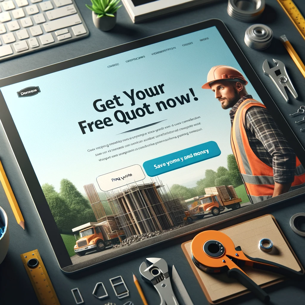
- Effective Calls-to-Action (CTAs): These are the signposts on the road to conversion. Make them big, bold, and easy to spot. Use action-oriented language that motivates a click.
- Benefits Over Features: Sure, your tech might be top-notch, and your materials top-tier, but what your clients really want to know is how your services will improve their lives or businesses. Focus on the benefits your company offers, like time saved, reliability, and quality assurance.
Quick Tips for Content That Converts:
| Element | Why It Matters | How to Implement |
|---|---|---|
| Clear Content | Reduces confusion, enhances user experience | Use simple language, be direct |
| Strong CTAs | Drives conversions, guides users | Place visibly, use persuasive text |
| Benefit Focus | Aligns with client needs, increases relevance | Highlight how features solve problems |
Testimonials and Reviews

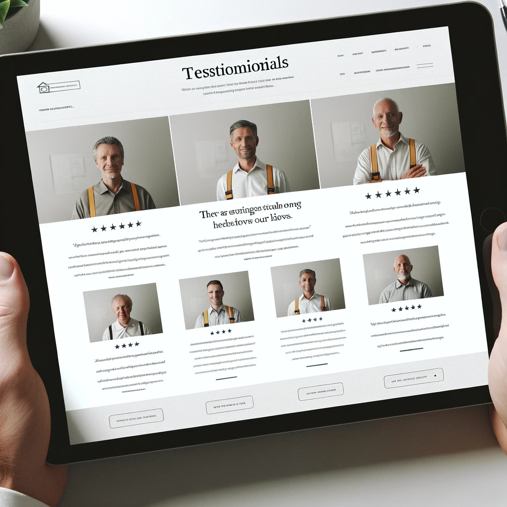
Hey, let’s talk about the power of a good word! In the world of construction, the feedback from past clients can be as solid as a foundation when it comes to building trust with potential new clients. Testimonials and reviews are not just nice words—they are your reputation made visible. Here’s how to make the most out of them on your website.
Why Testimonials Rock:
- Builds Trust: When prospects see that other people have had a great experience with your company, it lowers their hesitation and builds trust.
- Adds Real-World Proof: Beyond just telling people you’re great, testimonials show that you’ve actually delivered on your promises.
- Enhances Credibility: Featuring reviews from credible sources or well-known clients can significantly boost your company’s credibility.
Harnessing Testimonials:
| Element | Purpose | Tips |
|---|---|---|
| Selective Display | Highlight the best of the best | Choose impactful, detailed testimonials |
| Real Names and Photos | Add authenticity | Include the client’s full name and photo, with permission |
| Response to Reviews | Show engagement and commitment | Always respond to reviews, good or bad |
SEO Strategies

Alright, let’s get into the nitty-gritty of making your construction company website not just visible, but virtually unmissable on search engines. SEO, or Search Engine Optimization, is your best friend here. It’s all about making sure when someone types “best construction company near me” into Google, your website pops up as a top result. Let’s break down some SEO strategies that can help boost your site up the rankings.
SEO Must-Haves:
- Keyword Optimization: This is about including words and phrases that potential clients might type into a search engine. Make sure these are sprinkled throughout your site—titles, content, meta descriptions, even image alt texts.
- Local SEO: As a construction company, your market is often local. Make your presence known by optimizing for geo-specific keywords and registering your business on Google My Business.
- Quality Content: Regularly updated, valuable content not only engages visitors but also improves your search engine ranking. Think blogs, case studies, and news updates.
- Mobile Optimization: Since Google prioritizes mobile-friendly websites, ensure your site looks great and runs smoothly on mobile devices.
Quick SEO Tips Table:
| SEO Factor | Importance | Implementation Tips |
|---|---|---|
| Keywords | Helps in ranking for specific searches | Use research tools to find optimal keywords |
| Local SEO | Targets your business area | Optimize for local terms, claim GMB profile |
| Updated Content | Keeps site relevant and engaging | Regular posts, update old content |
| Mobile-Friendliness | Essential for modern web browsing | Responsive design, fast load times |
Up-to-Date Contact Information

Hey, let’s keep this simple: if your clients can’t find or reach you, you’re missing out—big time. Up-to-date contact information is like the front door to your business in the digital world. It should be inviting and, most importantly, easy to find and use. Here’s how you can ensure your contact details are doing their job on your website.
Why It’s Crucial:
- Visibility: Your phone number, email, and physical address should be prominently displayed, not hidden away. Consider having them in the footer or header of every page.
- Functionality: Make contacting your company as easy as a single click. Include clickable phone numbers and email addresses.
- Trust: Accurate and easily accessible contact information boosts credibility and shows professionalism.
Contact Info Essentials:
| Element | Importance | Implementation Tips |
|---|---|---|
| Updated Details | Ensures clients can reach you | Regularly verify and update info |
| Click-to-Call | Facilitates immediate action | Make phone numbers clickable on mobile |
| Map Integration | Helps clients find your physical location | Embed a Google Map on your contact page |
Ensuring that these elements are integrated into your site not only helps in SEO but also improves user experience and client satisfaction. Now, I’ll generate an image that shows a well-designed contact section of a website, illustrating best practices in presenting contact information effectively.
Regular Updates and Blog Posts

Hey there! Let’s talk about keeping your website fresh and engaging. Regular updates and blog posts are not just about filling your site with content—they’re about keeping your audience informed, engaged, and connected. This strategy not only helps in retaining customer interest but also plays a vital role in improving your SEO ranking. Let’s explore how to make the most of this dynamic content.
Why Regular Updates Matter:
- Fresh Content: Search engines love fresh content. Regularly updating your website and adding new blog posts signal to search engines that your site is active, which can boost your rankings.
- Engagement: Through blog posts, you can connect with clients by sharing relevant information, insights, or news. This builds relationships and establishes your brand as a thought leader in the construction industry.
- Repeat Visits: More content means more reasons for customers to come back. Each visit is a new opportunity to convert interest into action.
Content Strategy Essentials:
| Element | Purpose | Tips |
|---|---|---|
| Updated Content | Keeps website relevant and ranked | Regularly refresh existing content and features |
| Blogging | Engages and educates potential clients | Share industry insights, project updates, and tips |
| User Interaction | Encourages engagement and feedback | Include comment sections, ask questions, run polls |
Effective content updates and a vibrant blog can transform your site into a living, breathing hub of activity that not only draws in traffic but also fosters a loyal customer base. Now, I’ll generate an image that shows a modern and attractive blog page of a construction company’s website, demonstrating these best practices.
Conclusion

Well, we’ve laid quite the foundation together, haven’t we? By now, you should have a solid understanding of what makes a construction company website not just good, but great. From user-friendly designs that welcome every visitor, to engaging content that turns prospects into clients, every element plays a crucial part in building a site that truly represents your business.
Let’s recap the essential elements to ensure your construction company website really nails it:
- User-Friendly Design: Make navigation a breeze, and ensure your site looks good on all devices.
- Strong Visual Elements: Use high-quality images and videos to showcase your work.
- Content That Converts: Write clear, actionable content that guides users toward your services.
- Testimonials and Reviews: Boost credibility with genuine feedback from past clients.
- SEO Strategies: Enhance your visibility online with smart, targeted SEO practices.
- Up-to-Date Contact Information: Keep your contact info easy to find and up to date.
- Regular Updates and Blog Posts: Keep your content fresh and your audience engaged.
Each step we’ve discussed is a tool in your toolbox, ready to help you build a stronger online presence. So, take these tips, apply them wisely, and watch your website help your business grow—just like the finest of your construction projects!
Get Started Today!

Well, you’ve read all about how to boost your construction company’s website, now it’s time to swing into action! Don’t let your website be just another tab in someone’s browser. Make it a tool that actively contributes to your business growth. Whether you’re looking to redesign your site, optimize your content, or just start fresh, we’re here to help.
Here’s what you can do next:
- Contact Us: Ready to transform your website into a client-attracting powerhouse? Get in touch with us today for a personalized consultation.
- Get a Free Audit: Not sure where to start? Let us give your website a free audit. We’ll point out what’s working, what’s not, and how you can improve.
- Subscribe: Want more tips and insights like these? Subscribe to our newsletter and never miss an update!
We’re all about building foundations, both literal and digital. Let’s lay the groundwork for your success together. Reach out now, and let’s make your website as solid and dependable as the buildings you construct!
Next Steps Table:
| Action | What You Get | How to Proceed |
|---|---|---|
| Contact Us | Personalized Consultation | Click here to fill out our contact form |
| Free Audit | Detailed website review | Sign up here to schedule your free audit |
| Subscribe | Regular updates and tips | Enter your email here to subscribe |