Introduction

Hey there! In today’s fast-paced digital world, having a mobile-responsive website isn’t just nice to have; it’s a must—especially in the construction industry. Why, you ask? Well, think about your potential clients out on a site visit, checking out project updates or looking for construction services right from their smartphones. You want to ensure that your website delivers a seamless, user-friendly experience on any device they use.
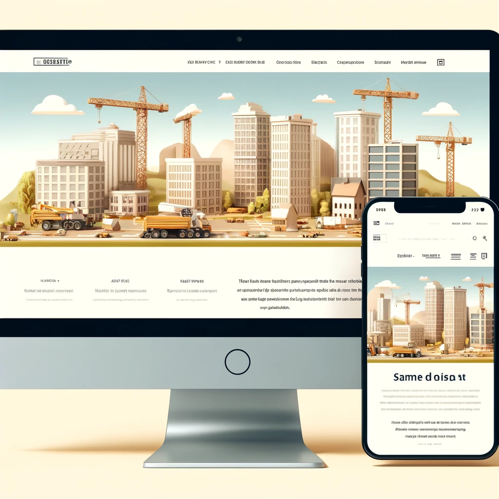
Mobile-responsive design ensures that your website adjusts beautifully no matter the screen size, from desktops to tablets to smartphones. This isn’t just about shrinking text or images; it’s about a strategic redesign of your site’s layout, content, and functionalities to offer optimal interaction wherever your clients are. For construction companies, this means showcasing your projects, services, and credentials effectively to every potential client, no matter how they access your site.
Now, why should you care? Because in the blink of an eye, a hard-to-navigate mobile site can send a potential client to your competitor. But get it right, and you significantly boost your chances of engaging more clients and building stronger connections.
Ready to build a robust online presence that stands strong across all devices? Let’s dig into the essentials of mobile-responsive design for your construction website!
Understanding Mobile-Responsive Design

Hey, let’s unpack what mobile-responsive design really means. Simply put, it ensures your website looks great and functions perfectly on every device, no matter the screen size. This is crucial because people access the web in so many ways—phones, tablets, laptops, you name it!
Key Elements of Mobile-Responsive Design
- Fluid Grids: These grids scale based on the user’s screen, ensuring elements resize in relation to one another instead of pixels or points.
- Flexible Images: Images that resize within their container elements prevent layouts from breaking on different devices.
- Media Queries: These CSS techniques allow your website to apply different styles based on the device’s screen size or orientation.
Benefits of Mobile-Responsive Design for Construction Websites
- Wider Reach: Your site becomes accessible on any device, expanding your potential client base.
- Enhanced User Experience: No pinching and zooming required—your site adjusts to fit the viewer’s screen seamlessly.
- SEO Advantages: Google prioritizes mobile-friendly sites, so you’ll likely see a boost in search rankings.
Common Pitfalls to Avoid
- Overloading with Heavy Media: Large files can slow your site down, especially on mobile.
- Ignoring Testing: Always test your site on multiple devices to ensure it works across the board.
- Skipping Updates: Technology evolves fast. Regular updates keep your site compatible and secure.
Tools and Resources for Designing a Mobile-Responsive Website
- Frameworks like Bootstrap or Foundation: These provide a basic structure for building responsive sites.
- Design software like Adobe XD or Sketch: Great for mocking up responsive layouts.
- Online testing tools like BrowserStack: Test your site on various devices and browsers.
Best Practices and Tips
- Prioritize Content: Simplify your site’s content to show only the essentials on smaller screens.
- Touch-Friendly Design: Make sure buttons and links are easy to tap.
- Test Regularly: Use tools to simulate different devices and adjust your design as needed.
Conclusion
Nailing mobile-responsive design is no small feat, but it’s crucial for keeping your construction business competitive in a digital-first world. By ensuring your site is accessible and user-friendly on all devices, you’re paving the way for more engagement, better SEO, and ultimately, more clients.
Call to Action
Ready to make your construction website mobile-responsive? Don’t let the digital landscape intimidate you! We’re here to help you build a site that looks great on any device. Contact us today to get started, or subscribe to our newsletter for more useful tips on staying ahead in digital design.
Let’s create an image now that visualizes the effectiveness of a mobile-responsive design, perhaps showing a content flow from a desktop to a mobile device to illustrate how the design adapts seamlessly across different screens.